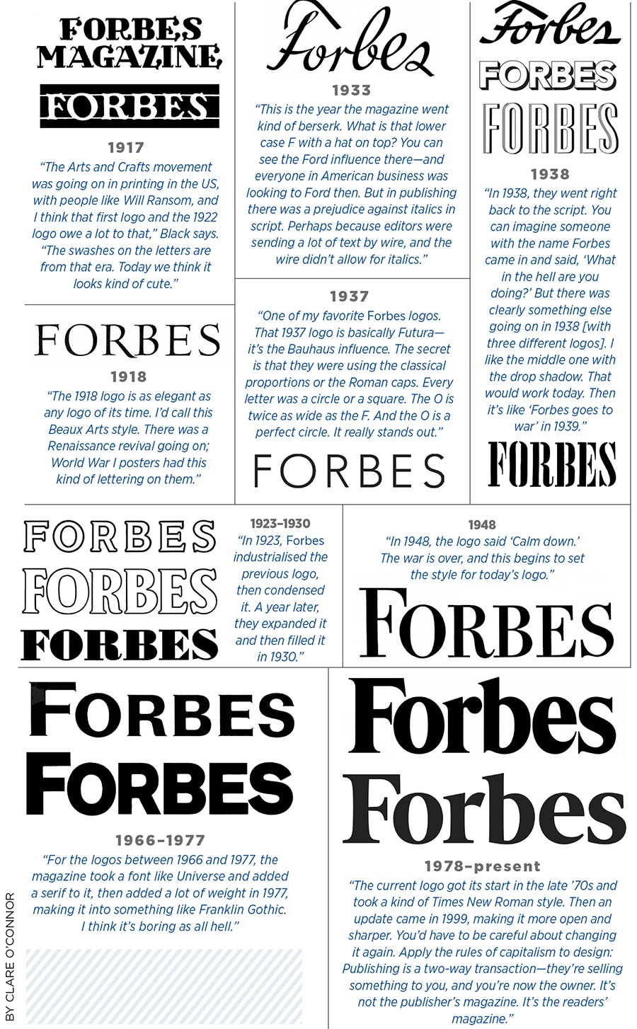
Forbes @ 100: How the brand's logo changed over a century
Forbes logo's evolution, annotated by a typography legend
Last Updated: Nov 07, 2017, 07:06 IST1 min


A magazine’s logo is its identity, beckoning the reader from the newsstand—or mail pile. In the case of Forbes, it also represents three generations of family stewardship. So what’s in a name? Forbes asked legendary art director Roger Black—a co-founder of the Font Bureau who has designed (and redesigned) countless magazines, including Rolling Stone and Esquire—to evaluate 100 years of Forbes typography, from pre-war swashes to post-millennial serifs.
First Published: Nov 07, 2017, 07:06
Subscribe Now