A mix of softness and exuberance, Pantone Color Institute unveils the colours of
As part of the various events and launches at New York Fashion Week, Pantone revealed its traditional Fashion Color Trend Report for Spring/Summer 2022
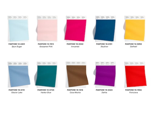
The Spring/Summer 2022 color palette unveiled by the Pantone Color Institute at New York Fashion Week Image: Courtesy of Pantone
Advertisement
With New York Fashion Week in full swing, experts from the Pantone Color Institute have lifted the veil on the colors that will be showing up in our wardrobes for the spring-summer 2022 season. Symbolizing the emotions stirred up by nearly two years of pandemic, between lockdowns, closures, cancellations and anxiety, the palette is both soft and dynamic, reflecting a need for serenity but also a relentless quest for freedom.
Does what we wear reveal what we"re feeling? Or maybe our desires? While fashion can sometimes seem futile, particularly in periods of crisis, it is clear that it is—and has always been—a means of self-expression and self-assertion. The colors, patterns, cuts, and textures that we select from our closets each morning and decide to put on are rarely chosen at random, whether we"re conscious of it or not they act as a window into moods, desires, needs, and aspirations of the moment—personal as well as collective.
As part of the various events and launches at New York Fashion Week, Pantone revealed its traditional Fashion Color Trend Report for Spring/Summer 2022, showing that men and women will vacillate between the need for comfort and security, and the desire for spontaneity next summer. "Colors for Spring 2022 bring together our competing desires for comforting familiarity and joyful adventure through a range of soothing and timeless colors, along with joyous hues that celebrate playfulness," said Leatrice Eiseman, Executive Director of the Pantone Color Institute.
This quest for softness, serenity, and security, should make its way into outfits and accessories tinted with blue, which comes in four shades including Spun Sugar, a light pastel, Glacier Lake, synonymous with tranquility, and Harbor Blue that Pantone associates with "our search for a safe space." This palette, which highlights balance and comfort, is completed by a delicate powder pink, Gossamer Pink, and a brown, Coca Mocha, symbol of a calming spirit.
But the daring among us, in search of adventure, spontaneity, and optimism after this trying period, will undoubtedly turn to more dynamic colors. Expressing ourselves in a liberated, bold fashion via vibrant shades like blue—once again—but this time in Skydiver, a more pronounced shade which, according to Pantone, "inspires us to new heights". The purple Dahlia shade also signals a certain dynamism.
An explosive trio completes this palette marked by vividness: the striking red Poinciana, the flamboyant pink Innuendo, and, brighter than ever, the yellow Daffodil, synonymous with, among other things, renewal. Note that Pantone adds to these ten colors a palette of five great timeless classics composed of a pure white, a sandy shade, two grays, one pale and one dark, and a green that evokes "health and wellness. A color chart that reminds us of the uncertain times the world has just gone through.