Tracking the Coronavirus Curve in Each Country
These charts provide a way to measure the overall trajectory of the coronavirus in each country and give insight into which ones are far from controlling the virus


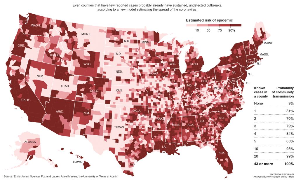
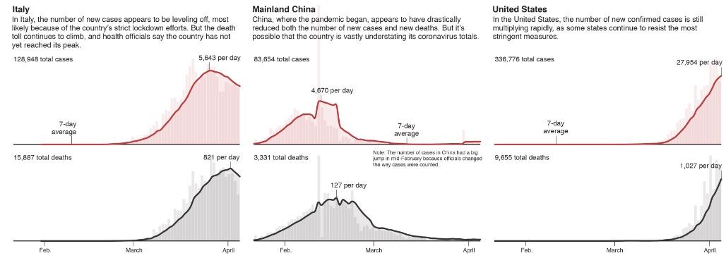
 As the coronavirus spreads silently through American cities and towns, people are struggling with questions about the benefits of social-distancing guidelines — especially in places that still have few reported casesThe trajectory of the coronavirus pandemic varies widely from country to country. The number of new cases each day appears to be falling in some nations.
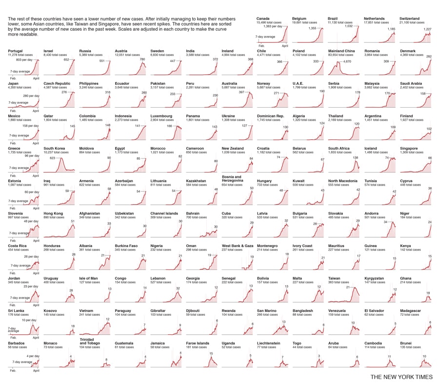
The charts show the number of new confirmed cases and new deaths each day, based on official accounts collected by The New York Times and Johns Hopkins University. Each line is the seven-day moving average, which smooths out day-to-day anomalies in how the data are reported by authorities.
The charts are not without limitations. Each country may have different reporting guidelines, which makes precise comparison among countries difficult. Some countries may be less proactive about testing or reach a limit in their ability to test, which could cause their numbers to be understated.
Still, these charts provide a way to measure the overall trajectory of the coronavirus in each country and give insight into which ones are far from controlling the virus.

 Note: Data is through April 5. Only countries with more than 50 cases of the coronavirus are shown. Sources: Local governments the Center for Systems Science and Engineering at Johns Hopkins University National Health Commission of the People’s Republic of China World Health Organization
First Published: Apr 07, 2020, 14:07
Subscribe Now