"Conflicting commodity correlations: Divergent trends could foretell cheer"
Commodity prices aren't moving in tandem and this may augur well for global growth


It was the best of times, it was the worst of times, it was the age of wisdom, it was the age of foolishness, it was the epoch of belief, it was the epoch of incredulity, it was the season of Light, it was the season of Darkness, it was the spring of hope, it was the winter of despair, we had everything before us, we had nothing before us.
This opening paragraph of Charles Dickens’ seminal work ‘A Tale of two Cities,’ sums up where we are with the commodities cycle. The prayer of lower prices has been more than answered and now the world worries about what it actually means for growth. There can be too much of a good thing, I guess.
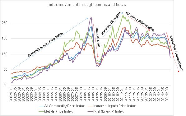
Let’s take a look at the trend over time:
Graph 1 Data source: IMF
The above graphic tracks the price movement of various commodities across the boom and bust cycles since the beginning of 2002. As expected, industrial commodities have followed economic cycles through their peaks and troughs. In the above, ‘All Commodity Price Index’ includes agricultural commodities while ‘Industrial Inputs’ includes energy, natural products and metals. ‘Fuel (Energy)’ includes coal, oil and natural gas.
The other worthwhile nuance that comes out is the high degree of correlation between commodities – they move broadly in tandem. Throughout this 13 year window period, there is almost no significant variation in movement, irrespective of commodity class, barring perhaps late 2006 /early 2007, when food and fuel prices did not rise as much as metals and other industrial inputs.
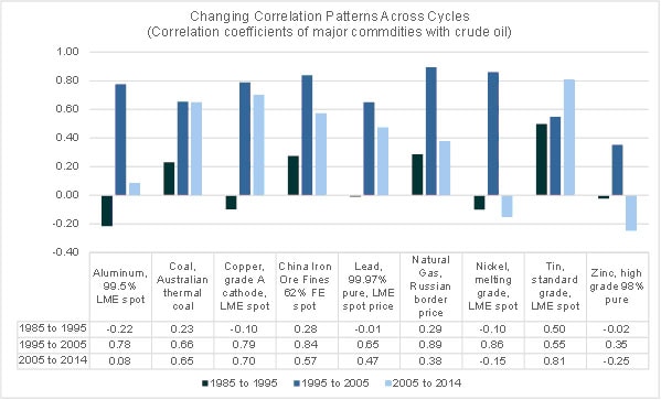
Now, how are commodity prices across classes behaving specifically in relation to oil?
Graph 2 Data source: IMF
For the analysis, non-overlapping, equal time periods for 1985-2014 period gave a logical bucket: '85-'95 was a stable decade for economic growth, followed by the boom of '95-'05 and then the volatile '05-'14. Based on that, the trend is interesting indeed.
What this seems to suggest is that, correlations are at best weak in benign periods (‘85-‘95). In boom times (‘95-‘05), the correlations peaked to near perfect positive levels as the world consumed more of everything (led by commodity hungry China).
What about the most recent decade?
What’s clear is that correlations with crude oil seem to be consistently coming down across commodities and in many cases, on a massive scale (eg. Aluminium from 0.78 to 0.08, Nickle from 0.86 to -0.15). So what’s unusual about conflicting correlation patterns? After all, everyone knows that in times of rising volatility, correlations do tend to collapse as individual asset classes start behaving independently.
What’s unusual in the trend above is that price patterns of all major industrial commodities are breaking away from oil simultaneously and more-or-less consistently (and as we shall see, logically).
The nature of Coal and Copper usage can be assumed to be somewhat similar to crude oil and hence correlations remain fairly high through the boom bust cycle (‘05-‘14). Natural Gas on the other hand has neither swung up nor plummeted with oil in '05-'14 (lower correlations) – this trend makes sense, considering they are substitutes of each other, in a way. Investment in LNG infra has led to increased supplies and reduced costs besides demand has been growing for the cleaner burning fuel from emerging economies like India and China.
What could we gather from this?
We live in dynamic and volatile times, which lend well neither to conclusions nor predictions. One pattern that appears from the above data is that oil market bearishness is partly a response to pessimism over growth prospects, but largely over its own demand: supply dynamics, evidenced by selective commodity correlation patterns (see also: Is the initial euphoria over reduction in oil prices set to end?).
Each commodity segment is behaving on its own merit of demand: supply equations and the declining correlations could be reflective of the fact that the crude oil market suffers from unfavourable dynamics of its own, which has little to do with the outlook on global economic growth.
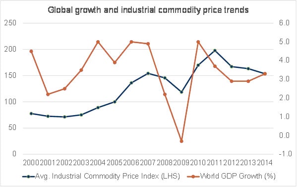
In conclusion, let’s look at a trend that is a little less open to interpretations:
Graph 3 Data source: IMF (2014 GDP growth is forecasted by IMF at 3.3%)
Outlook:
Barring two exceptions (2011: prices increased despite depressed global growth / 2014: prices declined despite higher global growth), the maxim remains true that higher economic growth is accompanied by higher (not lower) commodity prices.
A flash in the pan or a drop in the barrel – what will the oil price collapse bring for the global economy? Let’s wait and watch.
(The writer is former senior manager, corporate finance & risk management, Tata Steel)
First Published: Jan 22, 2015, 06:29
Subscribe Now