“What’s in a name," asked William Shakespeare in the classic Romeo and Juliet. “That which we call a rose, by any other name would smell as sweet," he reasoned. Well, he was right. A Rose would indeed smell sweet even if people name it Lily! But, little did Mr Shakespeare know that at times names can smell trouble.
Here’s how. The sweet smell turns foul when ‘Rose’ is not so ‘Rosy’, when ‘Lily’ becomes a butt of jokes because of her rhyming cousin ‘Silly’, when one gets confused between ‘Batliwaala’ and ‘Daruwaala,’ when ‘Mirzapur’ has shades of ‘Wasseypur,’ and when American ‘Nike’ gets to know about his illegitimate Indian brother ‘Nikey,’ Yeah, it pinches!
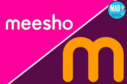
Well, when looks get deceptive—lookalike, soundalike, and all alikes—there is a problem. They confuse. They amuse. And they diffuse. This is what has happened with Meesho’s new logo, which comes strikingly close to that of McDonald’s. Harish Bijoor minces no words. “The new logo is deceptively similar to the Golden Arches," reckons Bijoor, who runs an eponymous brand consulting firm. A first look, he underlines, gives an impression of two tunnels. And once you get into a tunnel, you get lost in e-shopping. “So if this is what it means, then it’s okay," he says. “But it doesn’t mean this."
Before we try to look into Meesho’s new look through the lens of marketing, branding and advertising experts, let’s have a look at the ‘official’ nuances of the new look. “Our refreshed colour palette, infused with hues of Jamuni and Aam, perfectly captures the essence of India’s splendid diversity," tweeted Sanjeev Barnwal, founder and CTO of Meesho. Irrespective of income, location, language, gender or age, Meesho has become the go-to destination for a wide spectrum of Indian consumers, he added. “The new look is a true embodiment of this inclusivity," he maintained in his tweet.
Now Bijoor explains the problem with Meesho’s new look. “The colour palettes don’t go together. Jamun, aam and Indianisation seems to be a forced fit," he reckons. Logos, he underscores, are what they convey in first impression. And if the first impression makes you think about McDonald’s, then the entire branding exercise loses its essence. It just becomes a cola without fizz. “You don’t change your look to make you look like some other person or logo," he says, adding that brand looks must never be deceptive.
Well, there are notable global examples of similar-looking logos. But let’s go back to 2017, when trouble brewed between Starbucks and Starpreya. A South Korean coffee chain, Starpreya was dragged to court by American rival Starbucks for alleged infringement on its trademark rights by using a similar brand name and logo. Though the case was won by the local David, the point here is ‘Starpreya’ will always remind consumers of ‘Starbucks’ outside South Korea!
Back in India, marketing experts reckon that Meesho should have stuck to its own game. A brand which made a name for itself--Meesho never sounded like an Indian name to begin with, and struggled to convey to users that the brand name is derived from ‘meri shop’—with its innovative and quirky advertising, should have opted for a logo which didn’t dilute its identity. From ‘
arrey waah’ to ‘
sahi sahi lagaya hai’ to ‘
hamara mission, sabse kam commission to ‘
chote paise badi shopping,’ Meesho made a place for itself in the cluttered advertising world with distinct and sweet messaging, says Ashita Aggarwal, professor of marketing at SP Jain Institute of Management and Research. “It could have done a better job in designing a new logo," she adds.
Well, the biggest branding takeaway for Meesho is: Never look for lookalikes! Though ‘M
bole to’ can be more than Munnabhai, M must not look like Munnabhai!